Is your store leaking revenue?
Find out exactly where you're losing sales — takes 2 minutes.
Small design details separate stores that sell from stores that get ignored
Does Your Store Have a Design Trust Problem?
Visitors decide in under 50 milliseconds.
Quick Answer: What design fixes make a Shopify store look premium?
Seven specific changes transform store perception: more white space, a three-color palette, custom typography (two fonts maximum), consistent product photography, clear visual hierarchy, a trust-building footer, and decluttered product pages. Stores that implement these changes see conversion lifts of 15-30% — because 67% of consumers consider image quality more important than product descriptions.
That is how fast shoppers judge your store's credibility based on design alone. Not your product quality. Not your reviews. Your visual design — before they read a single word.
We audit Shopify stores every week at WebMedic. The pattern is always the same: the store owner has a great product, solid traffic, and a conversion rate stuck below 1.5%. The culprit is almost never the product. It is the Shopify store design pushing people away before they give it a chance.
The good news? Most design problems come down to a short list of fixable mistakes. And you do not need a redesign to fix them.
Here are seven specific changes — drawn from the principles in Refactoring UI by Adam Wathan and Steve Schoger — that separate premium-looking stores from forgettable ones.
Why Does White Space Make Your Store Look Expensive?
Cramming more content above the fold does not increase conversions. It kills them.
White space (or negative space) is the single biggest difference between a store that looks cheap and one that looks expensive. Open any luxury brand's website — Aesop, Apple, Glossier — and you will notice one thing immediately: they let their content breathe.
The fix:
- Double the padding around sections. If your sections have 40px padding, try 80px.
- Add 24-32px of spacing between cards and grid items instead of the default 16px.
- Give your hero section at least 50vh of vertical space. Let the headline stand alone.
White space is not wasted space. It is a signal that you are confident enough in your product to let it speak without shouting.
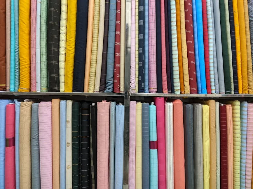
Should You Limit Your Palette to Three Colors?
Most Shopify stores use too many colors. Five, six, sometimes eight competing hues across buttons, banners, badges, and backgrounds. The result looks like a flea market, not a brand.
Premium design uses restraint. Pick three colors and stick to them:
- One primary brand color for buttons and key actions.
- One neutral (gray or off-white) for backgrounds and body text.
- One accent for highlights, sale badges, or secondary actions.
That is it. Every additional color dilutes your brand identity and adds visual noise. If you are not sure where to start, pull your primary color from your logo and build the rest around neutrals.
Why Should You Stop Using System Fonts?
Your store's typography says more about your brand than your logo does. And if you are running Shopify's default system fonts (or worse, mixing three different typefaces), your store looks generic at best.
The fix:
- Choose one serif or sans-serif for headings and one clean sans-serif for body text. Two fonts maximum.
- Set body text to 16-18px minimum. Anything smaller is hard to read on mobile and screams "template."
- Use font weight (bold, semibold, regular) to create hierarchy instead of adding more typefaces.
- Increase line height to 1.5-1.6 for body text. Tight line spacing makes everything feel cramped.
Google Fonts has hundreds of free options. Inter, DM Sans, and Source Sans Pro are solid choices for body text. For headings, try Instrument Serif, Playfair Display, or DM Serif Display.
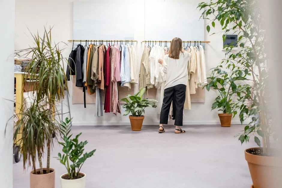
How Do You Make Product Images Look Consistent?
This is where most stores fall apart. One product shot on a white background, the next on marble, the next with a shadow, the next without. Inconsistent product photography makes your store look like a marketplace — not a brand.
The fix:
- Shoot all products on the same background (white, light gray, or a consistent lifestyle setting).
- Use the same aspect ratio for every product image. Square (1:1) or 4:5 works best for Shopify grids.
- Match lighting and color temperature across all shots. One warm image next to a cool one creates visual tension.
- Apply the same padding inside each product frame so items are sized consistently in grid view.
This sounds tedious. It is. But consistent imagery is the fastest way to make a store look like a real brand instead of a dropshipping operation. A study by MDG Advertising found that 67% of consumers consider image quality more important than product descriptions or reviews.
Does this sound like your store? Find out where you're leaking revenue — take the free Revenue Score. 3 minutes. Free. No pitch.

How Do You Create Visual Hierarchy on Every Page?
When everything is bold, nothing is bold.
We see this constantly in our ecommerce design audits: stores where every element fights for attention. Giant banners, flashing sale badges, multiple competing CTAs, autoplay videos — all on the same page. The shopper's brain cannot process it, so they do the easy thing: leave.
The fix:
- Each page gets one primary action. On product pages, it is "Add to Cart." Make that button the most prominent element and tone everything else down.
- Use size and weight contrast to establish hierarchy. Your H1 should be noticeably larger than H2, which should be larger than body text. Sounds obvious. Most stores ignore it.
- Reduce the number of competing elements above the fold. If your homepage hero has a headline, a subheadline, two buttons, a sale banner, and an announcement bar — cut at least two of those elements.
Schoger and Wathan put it simply in Refactoring UI: "Don't use font size alone to control hierarchy. Font weight, color, and spacing do more work than making text bigger."
Why Should You Design Your Footer Like It Matters?
Footers are the most neglected section on Shopify stores. Most owners throw in a copyright line, some random links, and call it done. But your footer is where shoppers go to verify legitimacy — especially first-time visitors from Southeast Asia who are cautious about buying from unfamiliar stores.
The fix:
- Include your full business address, phone number, and email. This is a trust signal.
- Add payment method icons (Visa, Mastercard, GrabPay, Touch 'n Go for Malaysian stores).
- Link to your shipping policy, return policy, and terms of service. Not having these visible is a conversion killer.
- Add a brief "About" blurb or brand mission statement. Two lines is enough.
- Use clean columns with clear section labels. A messy footer implies a messy business.
Your footer is the last thing a hesitant buyer checks before deciding to trust you. Make it count.

How Do You Remove Clutter From Product Pages?
Product pages close sales. Every unnecessary element on that page is friction between your customer and the "Add to Cart" button.
The fix:
- Remove sidebar widgets on product pages. Full-width layout keeps focus on the product.
- Kill floating chat widgets, pop-ups, and notification bars during the buying flow. They interrupt concentration.
- Move secondary information (full specs, detailed sizing, care instructions) into collapsible accordion sections below the main product area.
- Keep the space between your product image and the "Add to Cart" button tight and clean. The eye should flow naturally from image → title → price → button with no detours.
- Use a sticky "Add to Cart" bar on mobile so shoppers never have to scroll up to buy.
Every element you remove from a product page is a distraction eliminated. Premium stores know that restraint converts better than spectacle.
How Does Good Design Compound Into Revenue?
None of these fixes are revolutionary. Most take a few hours to implement. But together, they transform the perception of your store. A shopper who lands on a clean, consistent, well-spaced store assigns it more credibility — and credibility converts.
We have seen stores lift conversion rates by 15-30% after implementing these changes. Not because the product changed. Because the design finally matched the product's quality.
If you want to see how your store stacks up on design, speed, and conversion best practices, the Revenue Score gives you a full breakdown in three minutes.
Start with one fix. See what it does to your numbers. Then do the next.
Frequently Asked Questions
Do I need a custom Shopify theme to look premium?
No. Most premium Shopify themes are stock themes with good typography, spacing, and restraint. You can achieve the same result by customizing Dawn or any clean theme. The seven fixes in this post work on any theme.
Which design fix has the biggest impact on conversions?
Product image consistency and visual hierarchy tend to have the largest measurable impact. Consistent images build trust, and clear hierarchy guides shoppers toward the buy button. But spacing and color restraint set the overall tone.
How do I know if my store design is hurting conversions?
Compare your conversion rate to industry benchmarks. The average ecommerce conversion rate sits between 1.5-3% depending on your vertical. If you are below that, your design is a likely factor — especially if your traffic quality is solid.
Keep Reading
Ready to grow?
Find out exactly where your store is leaking revenue.
Answer a quick set of multiple-choice questions and we'll pinpoint your biggest revenue leaks — and whether we can help plug them.
Find Your Revenue LeaksFree · No obligation · 2 minutes